#TransformTuesday: 11 August
Every week, Transform examines recent rebrands and updated visual identities. This week's picks are below. For more from #TransformTuesday, follow @Transformsays
With a name like ClearScore, London branding agency SomeOne had a clear starting point. The new brand offers free and simple access to credit scores, thus its branding would also be clear and simple. SomeOne's Gary Holt says, The brand world was developed in combination with the team at ClearScore, and shows the very best combination of brand design and user interface design – where the customer, and their experience is firmly placed at the heart of the brand."
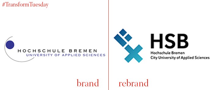
Bringing together four universities in the northwestern German city, Kleiner & Bold, a Berlin-based brand agency took inspiration from the city's icons to inform the new logo. The brand system uses a bright colour palette and employs the logo's x across multiple applications.
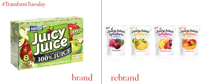
After Harvest Hill Beverage Company purchased the iconic American kids brand in 2014 from Nestlé, it sought to make changes to the visual identity. The rebrand changes not only the logo and visual style but the shape of the juice boxes themselves. The white background and bright colours are intended to help Juicy Juice stand out on the ever more crowded supermarket juice aisle.
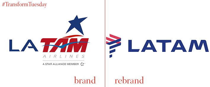
Mirroring the convergence of the Avianca and Taca brands last year, LAT and TAM airlines merged a few years ago. The slightly confused LATAM logo was intended to be a placeholder, as was the name. But, the airline recently unveiled the new, cleaner LATAM rebrand, carried out by Interbrand. "The logo was inspired by the identity and heritage of the region, incorporating the best of LAN and TAM. For this reason, we selected indigo and coral as the main colors for LATAM," says marketing VP at LATAM Jerome Cadier.
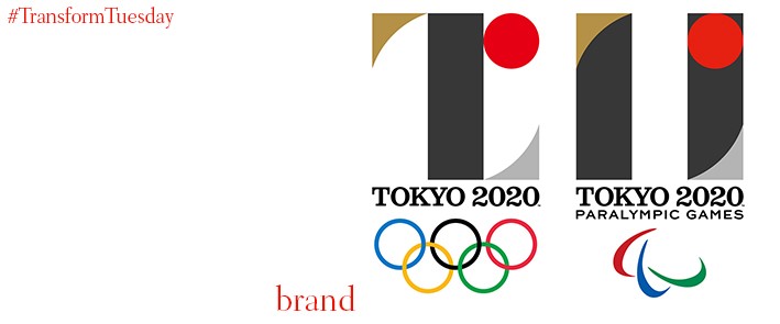
Olympic logos are always given the utmost scrutiny, especially when their design pushes boundaries, as with London 2012 or Mexico 1968. MR_DESIGN, founded by Kenjiro Sano, unveiled the Tokyo 2020 logo last week. Though there was some initial controversy, the log will inevitably join the annals of Olympic design. Heaped with meaning about the Games, the city of Tokyo and its Olympic tradition, Sano's branding will lend a thoughtful backdrop to the Summer Games.
Have a tip for next week’s #TransformTuesday? Send your suggestions here.