Creating a universal brand for Radio 4's Desert Island Discs

The BBC’s longest-running radio programme, Desert Island Discs has captured the nation’s hearts since it was first broadcast on Radio 4 in 1942. Presented by Kirsty Young since 2006, the programme’s erstwhile presenter Roy Plomley is credited with creating the enduring ‘castaway’ format whereby the weekly guest chooses eight songs, one book and one luxury item in the event of being stranded on a desert island. Despite Desert Island Discs’ longevity, however, creative agency D8 has recently led a visual identity update to extend the programme’s appeal to a younger audience.
Welcoming over around 3,100 guests in its 76-year history, Desert Island Discs’ remit extends from the obscure to the well-known, from footballers to classical musicians, and everything in-between. As Radio 4’s flagship programme, the creative agency which led the rebrand, D8, had to retain the sense of heritage and gravitas which makes Desert Island Discs so enduring – while developing a future-facing identity for the brand.
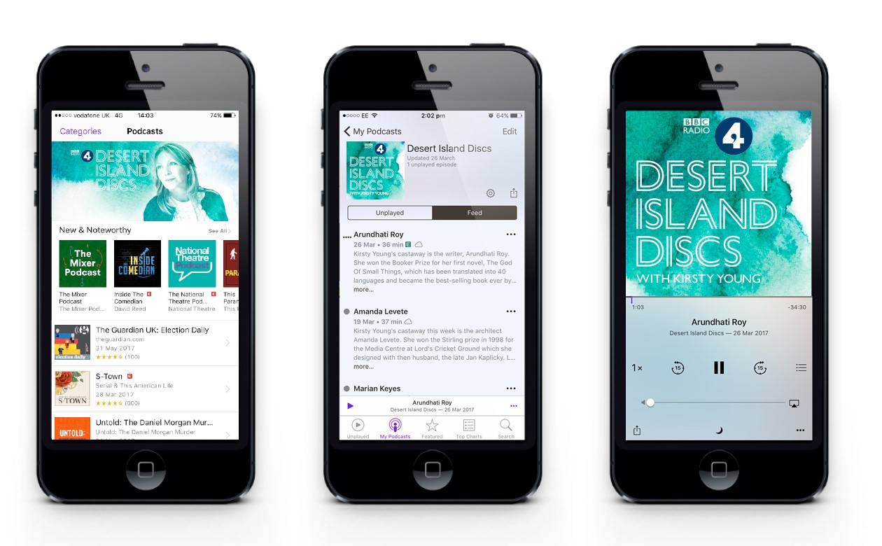
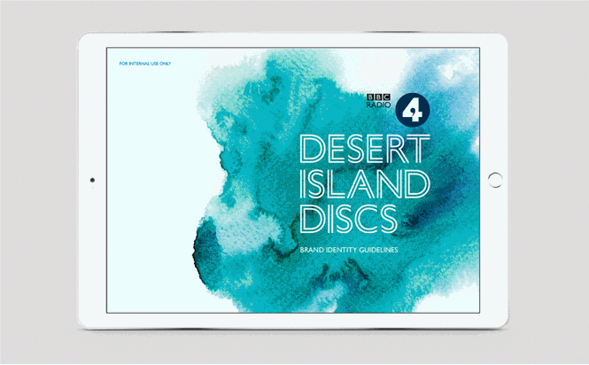
On the Desert Island Discs project page, D8 says, “We were challenged to convey the purpose and personality of Desert Island Discs in a fresh, contemporary style, that effectively reflects Radio 4’s tone and values, and to create a new set of brand applications and guidelines for use across digital, TV, print and podcast.” As a result, the updated Desert Island Discs visual identity caters for the programme’s extensive reach across social media and device screens. This also considers the numerous listeners of the programme through digital-first mediums such as the iPlayer app or digital radio.
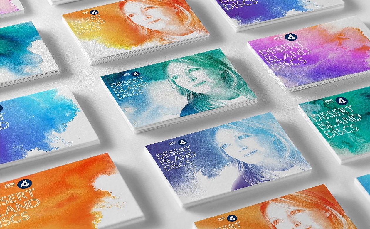
However, D8 was careful to ensure Desert Island Discs' much-loved personality remains at the forefront of its visual offering. D8 says, “For a programme so grounded in memory and recollections of life’s journey, we found inspiration in the colourful, indistinct watercolours of Marc Chagall. Their moody, dreamlike quality captures the intangible nature of memory and influenced our overarching concept.”
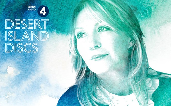
The images, which extend across the Desert Island Discs marketing collateral and online offering, depict the programme’s various celebrity guests in a watercolour paint style. With close-ups that focus on each person’s facial features, the sense of intimacy generated through Desert Island Discs’ question and answer format is reinforced. A warm colour palette consisting of greens, oranges and blues lends a tropical feel, generating imagery of the eponymous desert island.
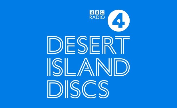
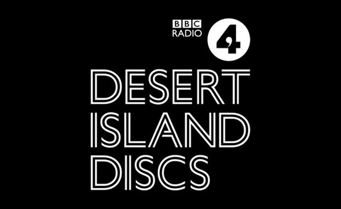
For D8, font was also key in effectively delivering the programme’s updated brand. “Our choice of type, which references the grooves in a piece of vinyl, is a custom cut inline typeface based on Gil Sans – a reinterpretation of a British classic that, in itself, is a metaphor for the rebrand,” says the agency.
Developing a new visual identity for such an enduringd brand is always risky. Yet Desert Island Discs retains enough of the programme’s classic design tropes to ensure its optimisation for an increasingly digital-first world will extend, rather than limit, the brand’s appeal. “The branding was intended to draw in next generation Radio 4 listeners who are smart, switched on and inquisitive, while still having an affinity with the loyal, heartland Radio 4 audience,” says D8.