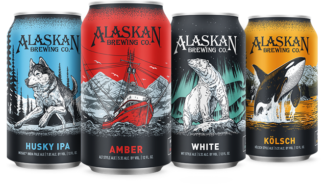
Auroras and orcas redesigned in craft beer packaging update
Nestled amid the islands, fjords and inlets of southern Alaska stands the state’s capital city of Juneau. Not as bustling as its northern counterpart Anchorage, or as chilly as university and oil town Fairbanks, Juneau is the proud home of a number of indigenous cultures, 32,000 people and the Alaskan Brewing Company.
The latter of which has, since 1986, brewed a range of beers from the pure glacial water of the Juneau Icefield. As it expands further across the US, though, it needed its canned beers to compete more effectively on a craft shelf ever-more littered with exciting designs and unique packaging. To do so, Alaskan Brewing turned to Seattle-based Blindtiger Design for a brand update.
Alaskan Brewing has always featured scenes from its native Alaskan wilderness on its packaging alongside a signature wordmark in a Native American-esque typeface. The beers have long had a clear brand architecture, determined by colour, as well. For its bottled beers, this was working effectively. But for cans, where increasing competition has meant higher design standards, it wasn’t working.
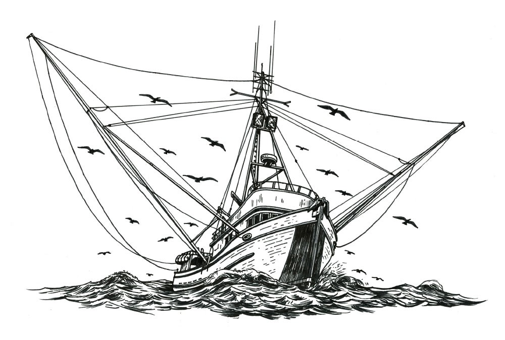
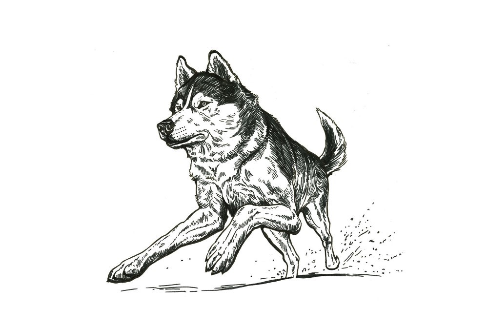
Blindtiger brought “the story of Alaska back to the labels” through a redevelopment of the packaging and imagery. The biggest change has been a move from more realistic images to illustrations reinvigorating the designs with energy and movement. A fishing vessel churning through white water has been transformed into a grand outrigger boldly sweeping through the waves. A static polar bear is now a confident hunter beneath an aurora-lit sky. “The redesigned artwork of our new cans is all about placing people in the breathtaking environment where we get to live and brew our beer,” says brand coordinator at Alaskan Brewing, Tasha Heumann. “We’ve taken that approach of connecting people to the thrill of Alaska with all the imagery of these new can products.”
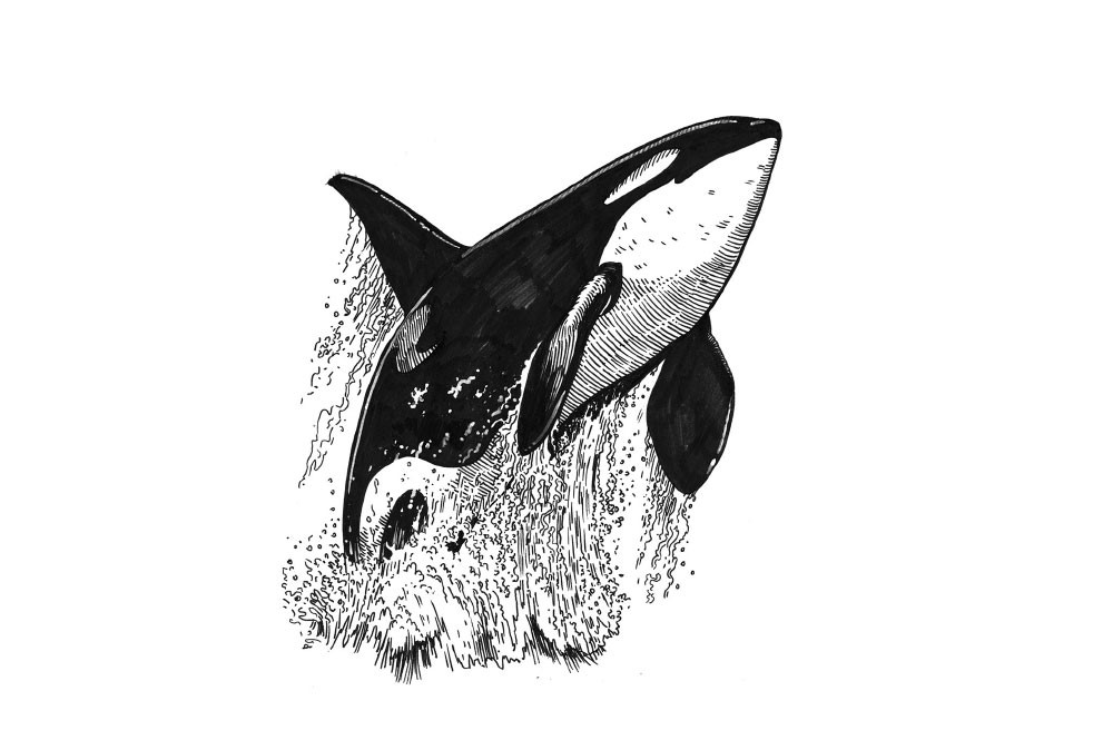
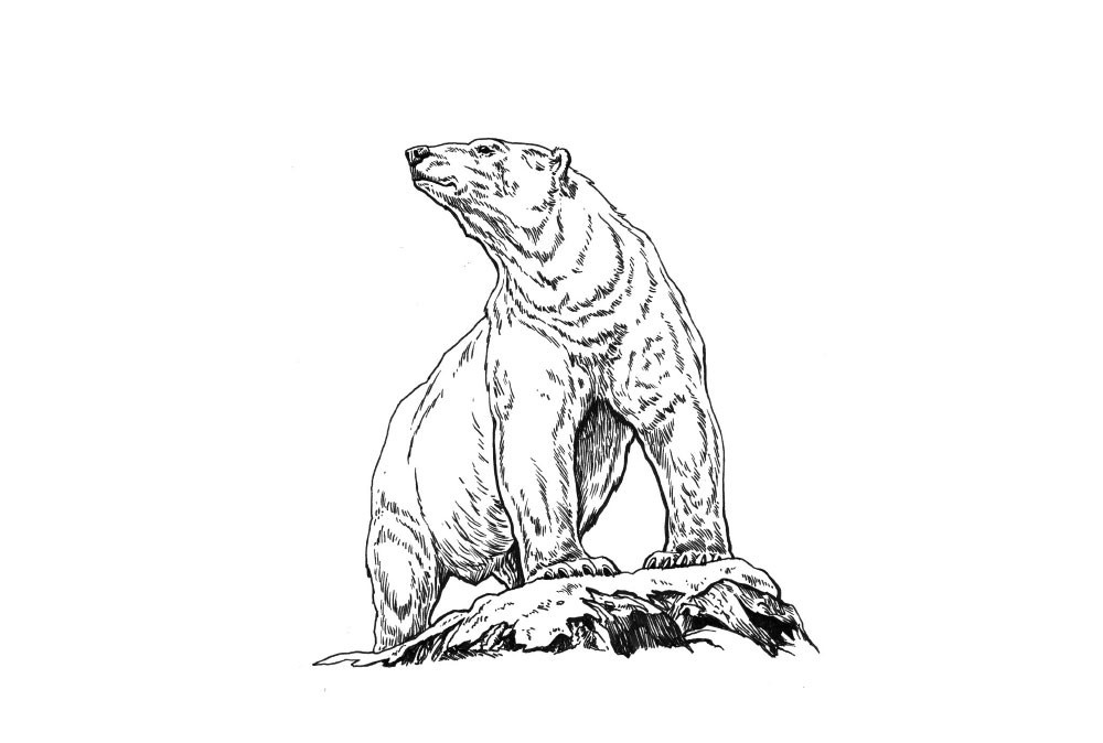
The other notable change is the introduction of a stronger type-led pack design. The type of beer is now boldly proclaimed on the side of the can, with short descriptions more easily legible beneath that. Tasting notes and the origins of the hops and malts in use provide a deeper connection with the brewing process and the brand.
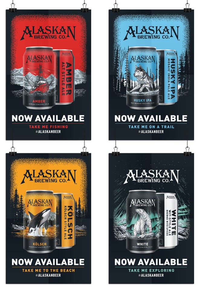
The approach is more flexible across point of sale and packaging, but also social calls to action. Blindtiger has developed a set of four inspiring posters calling on consumers of each beer to ‘take me on a trail’ or ‘take me exploring,’ with the streamlines clearly referencing the images themselves. It’s a strategy that should see Alaskan Brewing support its growth and compete against the plethora of canned craft options now available in store and on-trade without falling prey to some of the on-trend visual tropes that will have a shelf life as design within the category develops.

