#TransformTuesday: 23 August
Every week, Transform examines recent rebrands and updated visual identities. This week's picks are below. For more from #TransformTuesday, follow @Transformsays
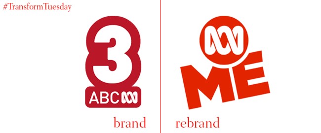
ABC ME
Last year, ABC rebranded its longtime teens and family channel ABC Family as Freeform, to embrace its audience’s changing desires. This month, ABC has also announced a rebrand of its children’s channel, ABC 3 to ABC ME. A new mobile app will feature strongly in the new brand, allowing for a more customisable experience for parents and children alike. The new brand will roll out on 19 September.
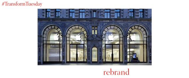
Apple
The iconic Apple Store needs no introduction. In fact, most of them don’t even have signage other than the Apple logo. Now, it’s not even a store anymore. The Apple Store is now officially, simply Apple. The retail aim is to have Apple stores become destinations and meeting places, not simply stores. Oh, and Genius Bars will be replaced by Genius Groves.
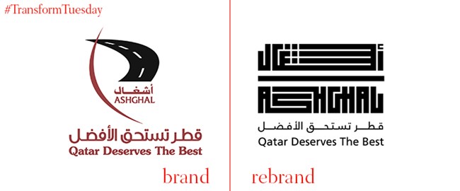
Ashghal
For Qatar’s public works authority, Ashghal, a revolutionary new brand identity is the way forward in a modern Arab country. Qatar-based brand consultancy Grow developed the brand strategy to position Ashghal as a primary contributor to national economic growth. The new logo derives its geometric shape from Kufic calligraphy, which replaces a multifaceted wordmark with a much simpler, eye-catching approach.
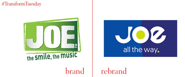
Joe
Challenged, but not destroyed, radio is evolving in the face of lower margins and fewer listeners. But for Joe, one of Belgium’s most popular contemporary mix stations, a new brand includes a focus on digital listening that puts the artist at the heart of the brand. Dutch agency Cape Rock worked with Joe’s owner Medialaan to make the brand feel younger and fresher.
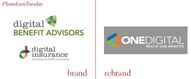
One Digital
Atlanta-based employee benefits provider, OneDigital Health and Benefits is now the name of the former two brands Digital Insurance and Digital Benefit Advisors. By unifying the two brands under one banner, the company is able to provide more streamlined service as the rebrand expresses what was already practically taking place within the business. CEO Adam Bruckman says, “While a refresh of our brand is exciting, what’s even more energizing is the fact that we are growing as an organization to more closely reflect both who we are and how we are adapting to meet the ever-changing needs of our clients and our industry.”
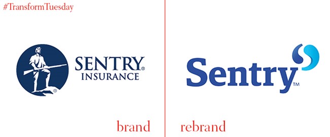
Sentry
American insurance provider Sentry has worked with Futurebrand that puts a yin yang symbol front and centre in the wordmark. The yin yang transmutes into quotation marks that act as conversation pieces throughout the visual system. The new brand replaces a staid logo featuring the gun-toting figure of a sentry. Now, the system is more flexible, vibrant and lively. The new tone of voice helps shed a bit of the unapproachable insurance-speak that dominates the sector.
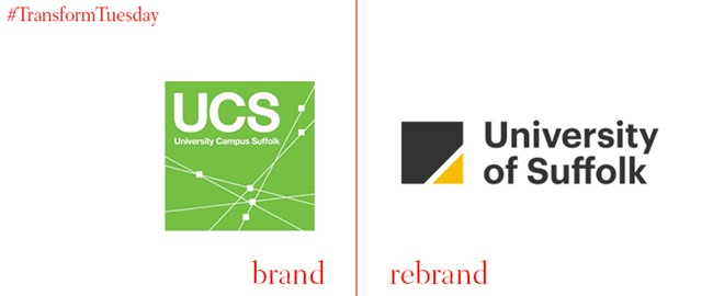
University of Suffolk
The University of Suffolk now exists in its own right. It is no longer a far-flung outpost of the Universities of East Anglia and Essex, but a fully-fledged university. Thus, its new brand, developed by Leeds-based consultancy Only Studio, is modern and flexible and aims to attract local students to remain in Suffolk and international students to study at the university. With charcoal, yellow and white as the core colours, consistency is prioritised. Yet, the striking signage bearing the new brand allows the yellow directionals to stand out on the dark grey background. Form and function have come together beautifully in the Suffolk rebrand.