#TransformTuesday: 21 August
Every week, Transform examines recent rebrands and updated visual identities. This week's picks are below. For more from #TransformTuesday, follow @Transformsays
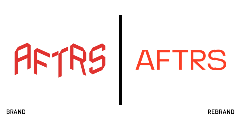
AFTRS
The Australian Film Television and Radio School (AFTRS) has launched a new brand identity and updated logo, following a rebrand project by Sydney-based design consultancy M35. Having produced many world-leading film produces, AFTRS is a core institution in developing the next generation of media talent - yet it required a strategic brand transformation to cement it as a ‘motion-first’ centre of talent. M35 says, “After a deep, consultative nine-month process engaging all levels of the organisation, the resulting brand [communicates] the fundamentals of contemporary storytelling and [marks] the school’s place in history. Applied across all channels and forms, the system drives recognition and impact, even when the mark isn’t present."
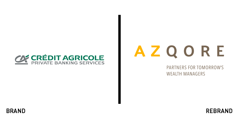
Azqore
Following its new partnership with French multinational professional services and business consulting corporation, Cap Gemini, Crédit Agricole private banking services needed a brand identity renovation, which would establish the business as an independent provider of core banking technology services. Strategic brand consultancy and digital agency, Nucleus, was tasked to create a global brand identity, as well as a new brand name. The ‘Az’ of the new name references the fact that the company offers banking services that cover, from A to Z. Furthermore, ‘qore’ references the nature of the core banking platform. Peter Matthews, CEO at Nucleus, says, “We designed the Azqore brand to present the newly independent business as a digital transformation partner for banks. The brand is deliberately precise, contemporary and highly distinctive.”
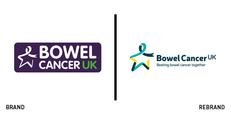
Bowel Cancer UK
Despite rebranding in 2016 following a project by digital marketing agency Adido, the UK’s largest bowel cancer-based charity has once again launched an upgraded logo and visual identity. Reflecting its merger with Beating Bowel Cancer, the charity retains its ‘Star of Hope’ and adds in a strapline, ‘Beating bowel cancer together.’ London-based brand and communications agency the Team carried out the Bowel Cancer UK rebrand, adopting a turquoise and yellow colour scheme in contrast to its previously stark purple. The Team says, “The ribbon from the Star of Hope becomes the main graphic device and runs through brand communications with dynamism, reflecting the charity’s energy and determination to inspire positive change. It is hoped that over time the Star of Hope will become as well known as other charity symbols such as Marie Curie’s daffodil campaign or breast cancer’s pink ribbon.”
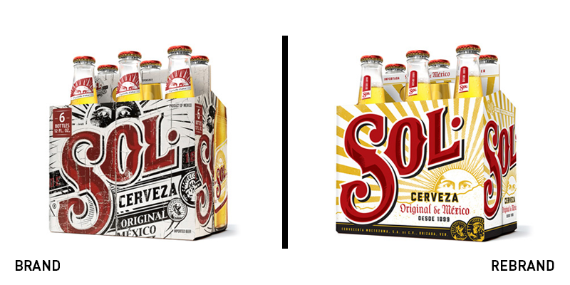
Sol
Ever-popular among the beer-drinking masses, the iconic Mexican lager-beer Sol has launched an updated logo and packaging identity. Founded in 1899, the story goes that inspiration for its unique sunshine-led identity and name came from a beam of sunlight shining through a gap in the roof of a hut. Now, the beer has an updated identity courtesy of Chicago-based branding agency Soulsight, following a relaunch by its owners MillerCoors. Refining its previously busy logo, the updated packaging and branding brings the key sunshine theme into prominence while repositioning the beer as a more premium offering. “We had a lot of conversations about how to capture the spirit of this brand, and the main touch points we kept coming back to is the old signage around Mexico — the old tin signs and the murals,” said Graham Ebetsch, senior design director at Soulsight. “We wanted to leverage the brand’s heritage in a really meaningful way to create a strong sense of place by drawing out the colours and vibrancy of the heart of Mexico.”
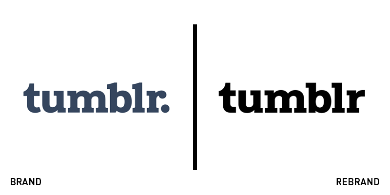
Tumblr
Tumblr, the famous microblogging and social networking website, has revealed a new visual identity and logo. The rebrand was designed by Swiss design practise Dinamo in collaboration with Tumblr’s in-house design team. The changes on the new logo are subtle, with the “t” and “r” of the bespoke typeface slightly altered and the curves being eliminated to achieve better on-screen translation. The logo’s period was also removed, allowing the logo and typeface to flawlessly integrate across all websites’ touchpoints. The result is a logo that is both bold and modern, without losing its recognisability and minimalist nature.