#TransformTuesday: 13 August
Every week, Transform examines recent rebrands and updated visual identities. This week's picks are below. For more from #TransformTuesday, follow @Transformsays
Claris
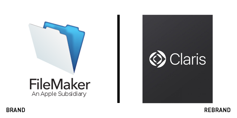
Claris – from the Latin word ‘clarus,’ meaning clear – was born in 1985 as an Apple subsidiary. The workflow automation specialist was renamed 13 years later as FileMaker, after its most popular product. But, now, another 11 years on, the word ‘FileMaker’ was too restrictive for a brand that had branched beyond the making of files. It turned to Siegel+Gale for support in a rebrand. The first task was to rename the brand, harking back to its founding title, Claris. “Finally, the name reflects our community. I’ve spent my career enabling others to make an impact on the world, and I draw energy from the impact our customers have at work. The word Claris, to me personally, reflects that bright shining light inside our community members,” Ann Monroe, VP of marketing at Claris, says. By reinvigorating the company behind a purpose – clarity of work – it brand became free to communicate the problem solving nature of its products. The new identity draws inspiration from a camera lens, eschewing the MacOS look of the FileMaker branding. The new strategy will help the company better communicate its purpose and positioning to an already loyal audience.
FA Wales
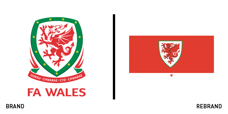
Football branding often takes cues from the team in question’s place and its sense of place. That can lead to representative, if uninspired branding mired in heritage but with little freedom of expression for the future. Brand agency Bulletproof, when tasked with updating the Football Association of Wales’ branding, draws on consumer-friendly tactics and energetic design to inspire the Welsh national team. The new visual identity features an updated crest, with a simplified dragon and shield outline. But it shines when the dragon breaks out of its constraints. Inspired by Welsh industry and craft, a bespoke typeface was deployed, merging traditional football lettering with a bold confidence more often seen on a beer label. Bulletproof says, “Like Wales itself, the new identity is built on craft, graft – and forged in the fires of industry. Rugged yet beautiful, natural but precise, it draws inspiration from the art of Welsh slate carving.” In all, it is a confident redefinition that sets the tone for a new era of Welsh football.
Founders Pledge
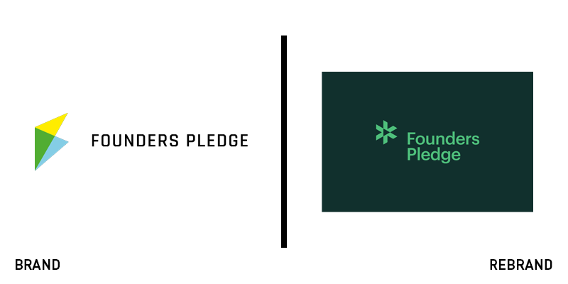
Founders Pledge has a unique positioning in that it supports entrepreneurs to build their businesses, while committing to charity contributions. The network model has helped the organisation build a user base and share its mission, but it is also what hamstrung the branding. “On the previous site, photos accompanying stories and articles were often provided by many different entrepreneurs. This frequently created a visual discord due to the photos being edited differently,” says brand agency Studio Mast. The Denver-based agency crafted a colour-grading style to be used across the Founders Pledge website, allowing the brand to create a unified, ownable look, despite the origin of the photos themselves. It also deployed a modular, grid system to be used across the visual identity, allowing for flexibility of use, but also catering to individual members’ needs. The primary icon has been updated to a stylised asterisk, replacing the more generic three-coloured kite logo of the past.
Grey Goose
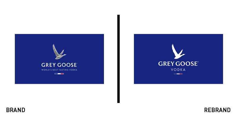
Only 22 years old, Grey Goose is already an icon. The standard-bearer for French vodka, its frosted glass bottle is recognisable on bar shelves and supermarket aisles the world over. But, its brand was static, with two key touchpoints – the flying goose icon and the packaging design – to its name. It turned to brand consultancy Ragged Edge to update the brand and its assets. The resulting wordmark is only subtly updated, with smoother letters and a flatter approach. But Ragged Edge also introduced a series of patterns for use across the range that help clarify the brand’s architecture. A new typeface and optimistic tone of voice complement the refreshed colour palette. The new brand has as yet only been put to use in a limited edition vodka, so the familiar frosted bottle update is yet to be unveiled. However, the approach taken so far promises a more flexible, punchier tone to the brand.
JSX
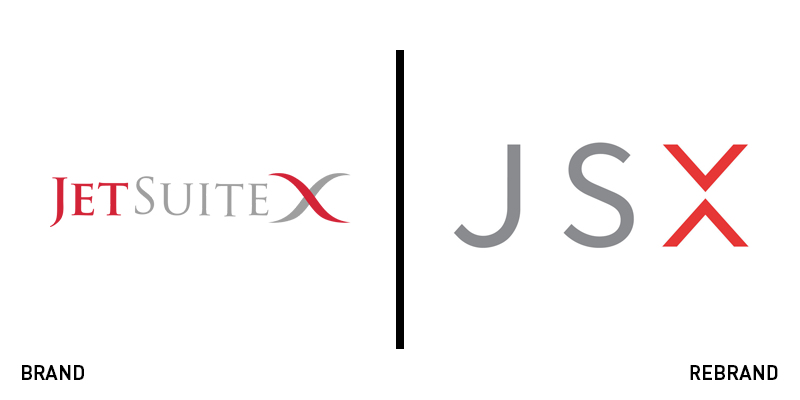
When JetBlue launched, it shocked the American airline industry with its amenities, ease of booking and travel and refreshed approach to industry norms. One of the founding execs from JetBlue is now the co-founder and CEO of JSX, formerly known as JetSuiteX. The ‘hop-on jet service’ hopes to redefine short-haul travel by providing quality service, efficient operations and paradigm-challenging options for short-haul flights in the US. JSX flies to seven terminals across the western US with accessible rates. Its brand, however, focused on its original conception as a charter service. Now, redefining its niche as a new option for those looking for faster, easier short-haul trips, it has turned to California-based creative agency Eleven for an updated visual identity and ad campaign. The new approach has seen it rebrand to JSX, simplifying the wordmark and depicting easygoing scenes of charter-like travel experiences. Artistic director at Eleven, Paul Wylde, says, “The concept behind the new JSX logo was to craft a symbol that was elegant, timeless and confident, yet modern - representing the courage, innovation and accessibility of the brand. The X has connotations of flight, movement and precision - conveying the operational excellence and commitment to service that is inherent with the brand.”

