Acccept & Proceed develops ‘vivid’ visual word for esports enterprise BaseStack
London-based creative studio Accept & Proceed crafted the brand identity for BaseStack, a new esports enterprise created by student housing provider BaseCamp. Opening this summer in Łódź, Poland, BaseStack will offer training camps and gaming centres across Europe.
The esports training camp provides a holistic approach to gaming, offering courses aimed at improving players’ ability, as well as modules focused on fitness and nutrition with the aim of optimising in-game performance. This selection allows gamers to ‘stack’ up their key modules of interest, which became the inspiration for its name ‘BaseStack’.
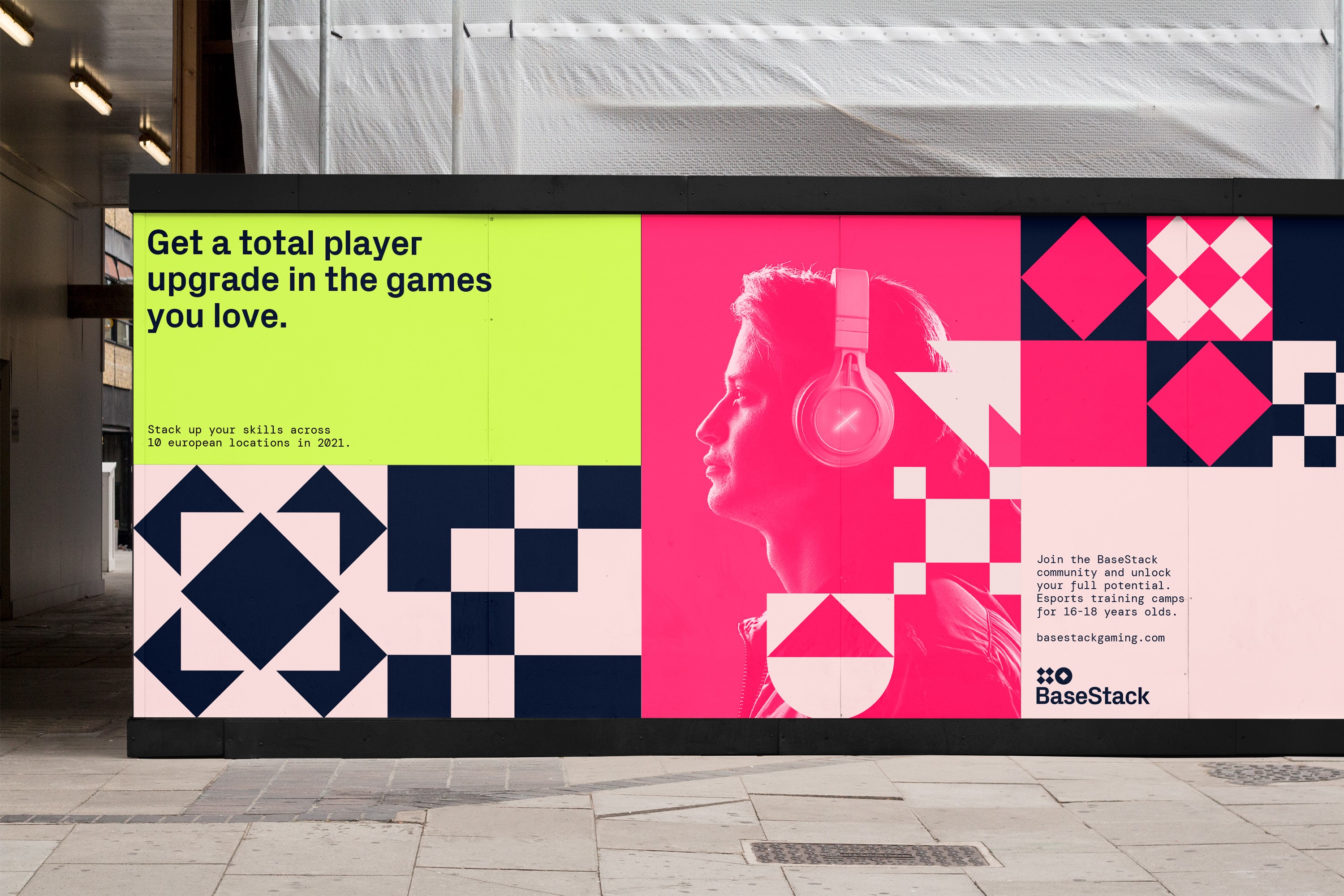
Taking inspiration from the gaming community, Accept & Proceed has crafted a system of symbols that represent game genres, skills, locations and event types. Each symbol has been crafted with its own set of motion behaviours. The symbols are used in a functional way throughout the BaseStack world, aiming to become a distinguishable language for those involved in the programmes.
“BaseStack exists to unlock the potential of all gamers, so it was crucial we create an identity that not only felt welcoming but also enabled BaseStack to celebrate the uniqueness of each game, event and gamer. The symbols created not only serve as navigation, but also allow for self-expression and provide the foundations of a shared language for the community,” says Alison Haigh, design director at Accept & Proceed.
To recognise the uniqueness of every game and every gamer, the identity system enables each event and attendee to generate their own ID. Event IDs are constructed using the location, followed by a number mirroring the naming structure of gaming titles. Gamers are empowered to generate their own unique IDs that highlight their preferred gaming genres, previous tournament wins and their screen name.
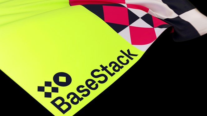
The headline typeface, Px Grotesk by Optimo, was chosen based on its simple, geometric forms that echo shapes found in the brand’s symbols. The vibrant neon tones of the colour palette were set against more muted pinks and blues in a bid to create a fresh, inviting feel in a space that often uses much darker colour schemes.
“We aim to push boundaries with our venture and the brand created by Accept & Proceed enables us to do just that. It is seamless and cohesive, while edgy and full of vitality,” says Janie Stamford, digital media director at BaseStack.