Atnahs rebrands to Pharmanovia to support global strategic vision
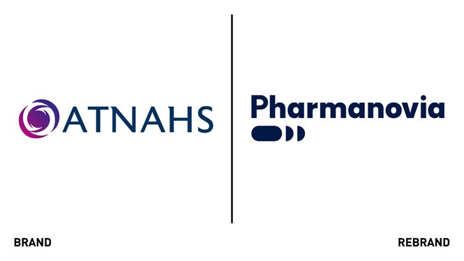
Atnahs, a medicine specialist backed by investment firm Triton Partners, rebranded to Pharmanovia to support its strategic vision globally.
The brand design was created by Frankfurt-based creative agency WhyBrand, and the implementation was supported by global branding agency GLIMMA and creative production agency, Lean Productions. The new brand name and identity seek to reflect Pharmanovia’s position as the original medicines specialist globally, as a committed, progressive global specialty pharma business and preferred partner for innovator pharma companies.
The new name comes from the innovative specialty pharma business, based in Copenhagen and operating through the nordics that Atnahs acquired in 2016. The name aims to bring connections of progress and innovation, while retaining authenticity.
The new logo represents impulse and movement, reflecting transformation and progression. It aims to capture the strategy of acquiring original medicines and breathing new life into them through promotion as well as line extensions. The blue in the refreshed colour palette was chosen to represent a dynamic and confident brand that retains its friendliness. In colour theory, blue is the colour of the ocean of the sky and symbolisms serenity, stability, wisdom and health.
The enhanced imagery tells two stories: one of patients taking part in life again; the other of the agility and commitment of colleagues.