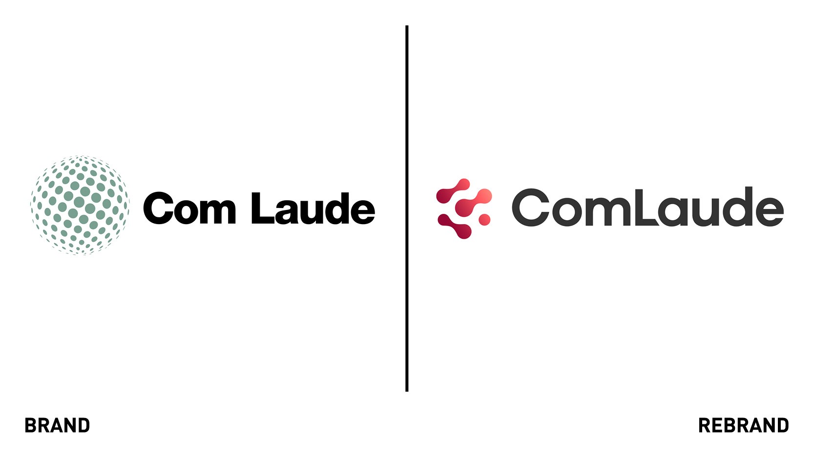
Com Laude unveils fluid identity in brand refresh by Designhouse
UK-based domain services provider Com Laude Group worked with London-based creative agency Designhouse to develop a new approachable and fluid ‘client-shaped’ corporate brand identity with global appeal.
The brief centered on communicating Com Laude’s trusted expertise and customer-centric, flexible approach but with a softer, more contemporary look and feel. The refresh was commissioned as part of a brand consolidation programme, following a period of organic and acquired growth.
“In the refresh, we were looking to introduce a vibrancy of voice and create a brand identity that would be inviting for both clients and prospects alike, and notably create audible differentiation between us and our competitors,” says Penny Hearn, group head of marketing and communications at Com Laude.
The new identity includes an evolved and flattened ‘world of dots’ logo and a new softer, geometric typeface, which ims to inject more personality and warmth to the visual identity.
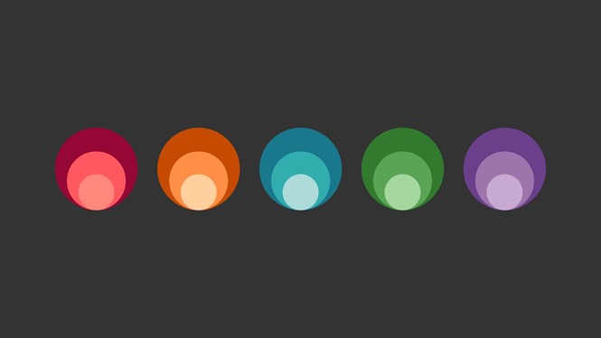
The new pegboard-inspired isometric design system represents each client’s ever-changing portfolio needs, while mercury-like connections between the dots were chosen to reflect the fluidity of the solutions offered by Com Laude. The new colour palette of muted grey and deep Cranberry creates differentiation in a market dominated by blues and greens, while the addition of peach and watermelon seek to add depth and energy to the overall identity.
“We focused on injecting more personality into the brand with a more contemporary design system and a fruit salad colour palette that is approachable without loss of professionalism,” says Matthew Gilman digital director at Designhouse.