#NewBrandMonday: 8 March
Here are this week's selection of newly launched brands from around the world. For more from #NewBrandMonday, follow @Transformsays on Twitter.
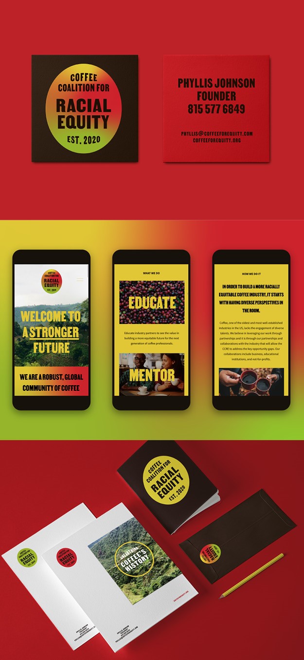
Coffee Coalition for Racial Equity
The Coffee Coalition for Racial Equity (CCRE), a new brand dedicated to building an equitable coffee trade, worked with New York-based brand design studio ThoughtMatter to create a branding rooted in the traditions of protest that calls attention to the full story of the coffee plant people use on a daily basis. CCRE, lacking a recognisable logo to visually identity itself, came to ThoughtMatter with a need for a true brand. The organisation needed and identity and platform to express its mission and purpose in clear terms. To do so, the agency took the coffee conversation back to the source: the coffee cherry -- a wild plant with bright red cherries grown in 9th-century Ethiopia that became a powerful beverage whose trade shaped the course of humanity. The idea behind this was that using the bean as a symbol disregards the labour and work of people of colour, while the cherry represents the fruits of CCRE’s labour. This then became the anchor of the overall identity with the oval shape of the coffee cherry providing a unique badge-like logo for the coalition to stand behind and be proud of—a symbol of the movement. Gradients were incorporated to represent the shift in the industry towards racial equity with green representing the history of race in coffee, yellow signifying education, and red encouraging urgent action.The typeface, Martin, was also chosen for its historical significance designed by Tré Seals, the founder of Vocal Type Co who started the type foundry in response to feeling like black type designers like himself were not represented in the design industry.
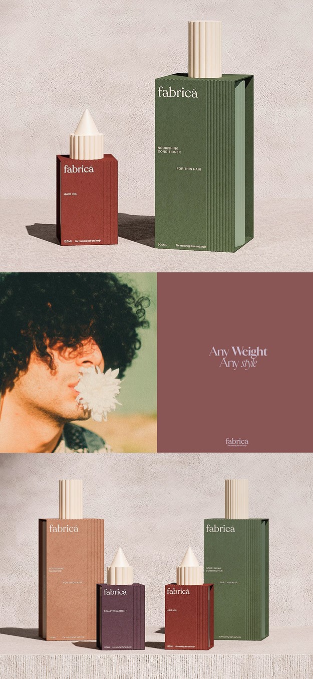
Fabricá
Sheffield and London-based design agency Lyon & Lyon Creative developed the branding and packaging for Fabricá, a unisex hair care concept specialising in products for both thick and thin hair. The brand name derives from the Latin name for ‘texture’ and refers to the variety of hair textures that the products help to restore. The theme of texture is at the centre of the brand identity, seen through the unique thick and thin ridges on the packaging, which reflect hair types that the product is best suited to. The lines are echoed as assets throughout the brand application, from business cards to social media. Social media photos include a combination of close up lifestyle imagery and more traditional, natural imagery to reflect the brand’s natural, ethical credentials. The packaging’s colour palette is earthy, including an olive green for conditioner and a sand colour for shampoo. In an attempt to move away from single use, petroleum based plastics and reduce harmful impact on the environment, Fabricá uses bottles made from Polylactic acid (PLA), fully compostable and recyclable material, made from non-GMO plants. Each bottle is individually wrapped in a textured, recycled cardboard sleeve.
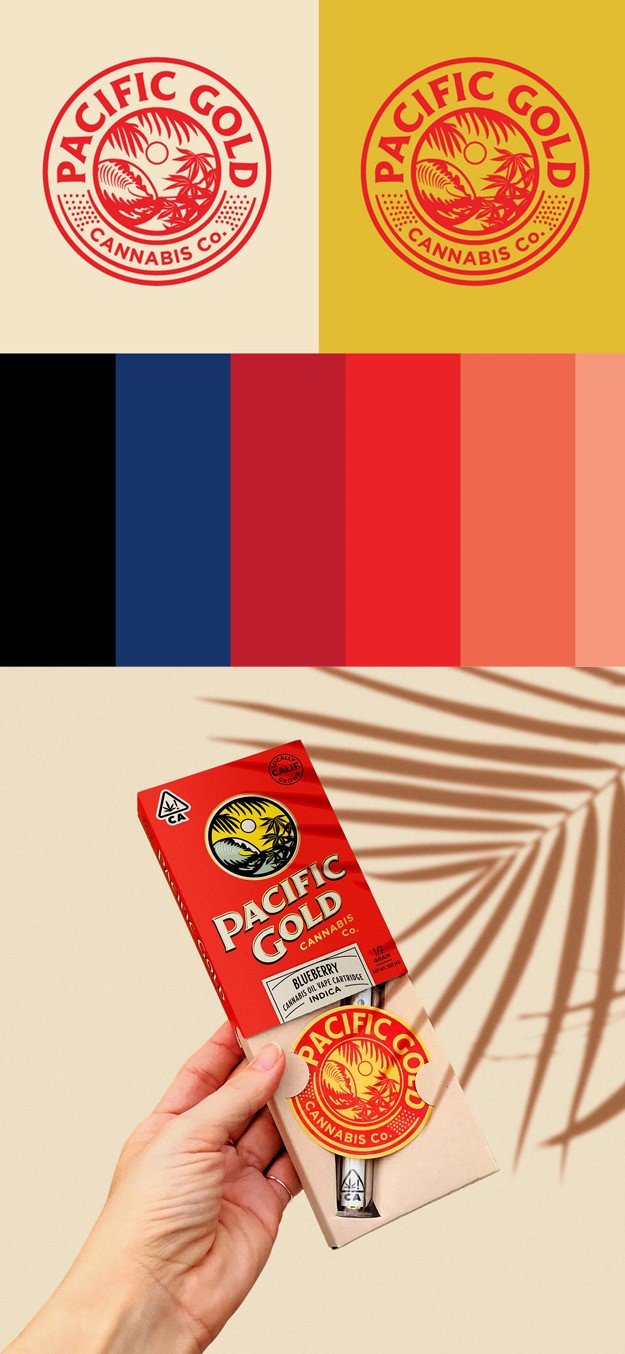
Pacific Gold
New cannabis brand Pacific Gold worked with Southern California-based design agency Hoodzpah to create a brand that would be accessible to everyone, not steeped in weed tropes but that would appealing to the growing demographic of cannabis consumers. The brand’s archetype is ‘The innocent,’ based on happiness, a type of ‘vacation mentality’ even on a Monday morning. This is epitomised in the logo, which depicts palm trees with a backdrop of the ocean and the sun, giving off a relaxed island vibe.The goal was for Pacific Gold to feel medicinal like many other cannabis brands while also steering clear of the neon green or black and gold ‘stoner bro culture.’ The colour palette is heavily inspired by vintage fruit and vegetable farm crate designs, with warm red, yellow and turquoise colours differentiating the Pacific Gold sativa, indica and hybrid categories. The wordmark is a customised treatment of the typeface. acific Gold’s packaging is warm and inviting, a bright pop of color amidst the blur of green, kraft paper, black, and gold. Easy application stickers further differentiate the strains. Pacific Gold vape pens abandon the standard neon colored LED tips for a warm white.
Permission
Permission, Toronto’s first size-inclusive and body-positive retail experience for curated aesthetic fashion, worked with Toronto-based design agency Vanderbrand to create a bold, empowering and flexible brand system and visual identity. The brand reinvents the concept of activewear with a retail store and supporting digital platform that embraces the body in all states and celebrates authenticity. The brand identity itself is a representation of the body’s fluidity and flexibility. Set confidently in a condensed typeface with wide alternate glyphs, each application of the logo variant visualises the countless evolutions that individuals experience. The bold and interactive typographic treatments act as a graphic expression of bodies in motion, a concept which is further enhanced through the strong use of colours in the merchandise highlighted in campaign photography. The sweeping curves of the architectural design used throughout the flagship store informed and amplified the typographic language with the evolution of each letter’s form. The extension of the letter ‘P’ in ‘Permission’ is a primary condition of the visual identity, highlighting the arched details in the retail store as well as the forms of physical movement. The strapline ‘Own your permission’ expresses the core concept of the brand: owning ones permission to own ones body, beliefs and boundaries.
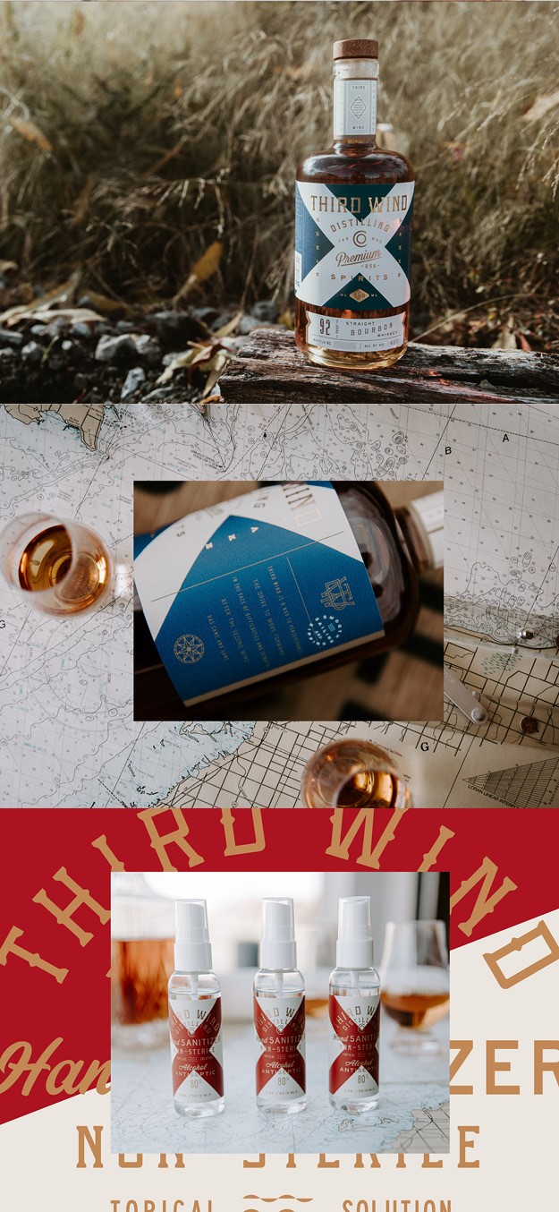
Third Wind Distilling
Third Wind Distilling Co, a new brand of whiskey produced from a family-owned distillery, worked with North Carolina-based Device Creative Collaborative to develop an authentic and bold visual identity that pays homage to heritage and its strong, all-American local roots. Bay City locals from way back, the owners of Third Wind Distilling had begun distilling as a way to spend time together. The agency chose to root their brand in the family’s story of perseverance, drive and connection, which is what today’s consumers expect a brand to embody, and are willing to pay a premium for. The name Third Wind was chosen for its evocations of pushing through together in tough times and a nod to Bay City grit. Bay City roots are also referenced in a bold take on the maritime code of signals, an eye-catching system of symbols rich with meaning for the seafaring crowd. The gutsy language and locally anchored motifs speak to that all-American trait of sheer dogged determination abound.