Perq Studio develops a fresh brand strategy and identity for Hunu
Hunu, a collapsible and reusable coffee cup brand, worked with London-based brand and marketing agency Perq Studio to develop a fresh brand strategy and identity. The rebrand aims to encourage people to rethink the impact of their lifestyles, expressing that conscious living doesn’t have to involve compromise.
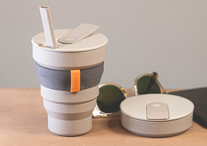
After a successful launch of its first collapsible cup, Hunu needed a distinctive brand that marked their evolution beyond a single product business. The challenge was to develop a brand identity that makes people feel proud to own and use reusable products, empowering them to live more sustainably.
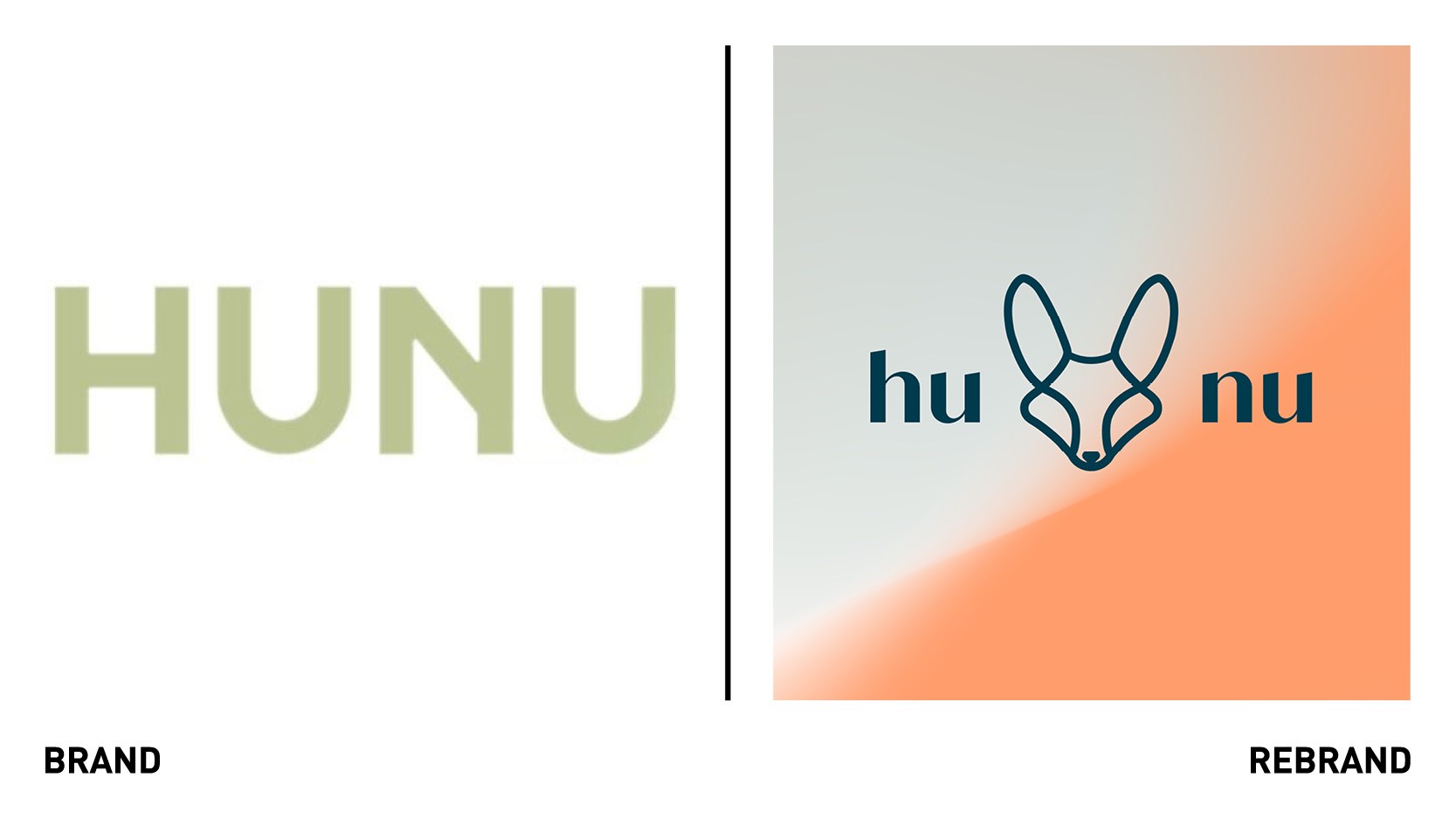
Perq Studio developed a brand mark, the Cape Fox, that speaks to Hunu co-founder Vince Dickson’s South African heritage. With its large ears and distinctive shapes, the logo seeks to embody the style of the brand’s products alongside its love of the natural world.
“The future is green. And disruptive brands like Hunu don’t just make sustainable choices effortless; they make them enjoyable. That’s why the Cape Fox is such a perfect brand mark. They’re both energetic and elegant, and in folklore act as guides – just as Hunu guides people to more mindful living,” says Perq Studio’s founder and MD, Laura Giffard.
Hunu and Perq Studio both felt the brand shouldn’t be judgmental as it’s about making more mindful decisions and being a slightly better version of oneself, every day. This was encapsulated in the new strapline, ‘Go Again,’ which speaks to growth and improvement, as well as the joy of using a durable product continuously.
The brand look and feel aims to encompass the power of community and allow Hunu to build a storytelling platform that highlights stories from around the world.
When developing the new colour palette, Perq Studio wanted to encapsulate the brand’s love of the natural world. Sunburst expresses the joy of a cloudless sky, while ocean and sand were chosen to evoke the planet’s locales, from beach to desert.
To reflect the founders’ connection with the world of fashion, Perq Studio needed a typography that wouldn’t look out of place on a magazine cover.
They settled on Kalista, a luxury font with a handcrafted style. “Kalista exudes luxury. It tells you that the sustainable products you’re using don’t compromise on style. But it’s also quite modern, warm and inclusive,” says Giffard.
“The cup is such a great product, but the brand is about more than that. It’s about community, learning, enjoying life and feeling empowered to improve the world. We’re proud to have captured that spirit with this new brand identity,” says Giffard.