Postcard from Amsterdam
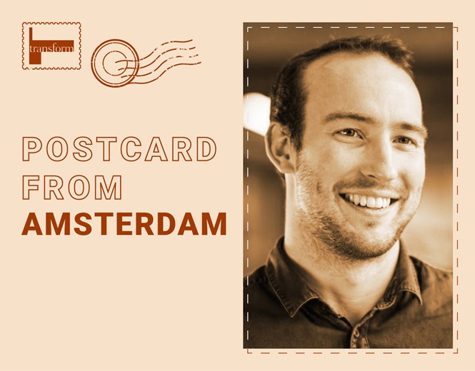
James Lancaster, global brand experience lead at Reckitt, speaks to Transform magazine about the distinctive aspects of the branding industry in Amsterdam and, more widely, The Netherlands. He discusses the most noticeable design influences of The Netherlands and the changes he experienced when he moved from Reckitt’s HQ in Slough to its Amsterdam offices.
What is distinctive about the branding industry in Amsterdam and more generally in The Netherlands?
The branding industry is a curious one within the consultative space. Your typical consultant will be brought in to get an external perspective on tackling a particular issue, but branding consultants are asked how brands can amplify their own perspectives! And with that comes a curious empathy that seems to unite branding culture globally. Something that I have found, and this is my personal take on it having stepped over the pond, is that trying to maintain that empathy requires a huge amount of effort when caught in the rat race of London, New York or Hong Kong.
When you walk through Amsterdam, the city feels young despite its extraordinary history. It feels progressive while championing and protecting the craft (particularly local makers and artists) and feels egalitarian while rejecting the slightly pernicious ‘cancel culture’ that seems to be creeping in elsewhere. Designers here have access to influences from every corner of the globe, as well as the mental, emotional, and physical space to craft it.
Amsterdam packs a huge punch for a city 1/7th of the size of London. There is a confidence here that doesn’t need to be brash or provocative and that comes through in the work. So when looking at Dutch design at a macro level, I would say that the craft is the thing that stands out – where UK design is all about the story, Dutch design is about the craft.
How much of Reckitt’s work in Amsterdam is informed and influenced by the city? How did your work change when you moved from Reckitt’s headquarters in Slough to Amsterdam?
Amsterdam’s inclusivity as a city, and its egalitarian nature, allows for the office here to have a relatively flat hierarchy. Progress feels like collaboration rather than just delivery. You’ll see this in the social culture that comes out of the way the teams operate. The Slough HQ was a big corporate building on a corporate road, whereas the Amsterdam office is part of the World Trade Centre, which is connected to Schiphol. There is a meet-up culture around that, as it’s full of hotels, cafes and bars. It feels tightly knit, with a closer team.
There are also aspects of Dutch culture that come into play. There is a sort of a respect for the individual, and for the work life balance. It supports Reckitt’s view that work is something that you do, and you have to you have to enjoy it, it's part of life, but it's not a ‘live to work or work to live question.’ The two are inherently linked.
What are the most noticeable design influences of The Netherlands as a country?
If I would have to describe Dutch output in one word, I’d say it’s uncomplicated, and with that comes a real elegance. Every year I take a couple of days to go down to Eindhoven, in the south of the country, to the Dutch Design Week, a gathering of all students from around the country who showcase their design projects. The exhibitions cover a range of topics from designing for mobility to circularity and regenerative ecology. But the thing that always strikes me the most, is the simplicity of the idea behind each design.
In 2019, for example, there was a war memorial piece in which the designer had interviewed three surviving veterans in the County of Brabant and created 3D prints of their memories. There were 75 different memories developed from the conversations the designer had with the veterans, with white print used for daytime memories and black print for night time memories. It was simple yet really powerful and emotive.
What kind of branding macro-trends exist in Europe that are not present in other continents?
When I first started out as a graphic design intern at a company called the Brand Union in Dubai, my design director said that good design is about removing one more thing than you think is necessary. Although that was bang on at the time, it seems like the trend for European design, particularly European forward design, is taking that simplicity to the nth degree. Packs now have tiny typography that tells people what the product is and then a giant letterform as the only feature. It began in cosmetics and then crept into food and now it has reached some fast-moving consumer goods categories.
Design is supposed to communicate, it’s supposed to be immersive and it’s supposed to be intuitive. Having one letterform doesn’t really help me navigate or understand what the product is and why I should choose it. It seems to be designed to connect with this fashion forward thinking that’s all about simplicity.
With Reckitt being a global brand present in many different countries, how does it make sure it has a unified brand identity yet also caters to each country it exists in?
The most important tool for us is the ‘brand world,’ which is essentially a hub for each of the brands whereby we set out the aspirations for the brand as a whole. It acts as a lighthouse, showcasing what the brand could be. It’s a source of inspiration for anyone working on the brand to see how we can bring things to life, products, or new concepts. For example, when bringing a new product to the market, the brand world is a guiding light, pointing out ‘this is how we’ve done things in the past, this is how we unite our assets across different touchpoint in the journey and this is how we lean into parts of the conversation at different parts the user journey to maintain relevancy.’
The way I view it is that as a global design team, our role is to inspire everybody on the ground to co- create coherently. So lay out the ambition, lay out the gold standard, lay out the lighthouse and say: ‘Here are the toolkits for you to achieve this. We're going to take this one 70-75-80 % of the way there for you, but it's your conversation.’ It's a slight evolution from typical guidelines, because rather than just saying, ‘here's the assets here are your dos and don’ts,' we start to treat the brand as a character and point out the conversations consumers have. A major part of the brand work is about aligning all the different brand touchpoints, from digital comms to product to signage, together.