UK’s largest LGBTQ+ develops new strategy and visual identity
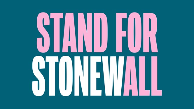
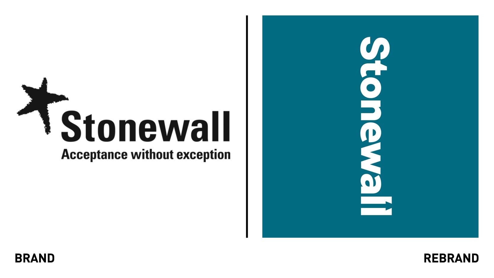
The UK’s largest LGBTQ+ organization, Stonewall, has launched a new strategy and brand identity, shifting its positioning from ‘Acceptance without exception,’ to ‘Freedom, equity and potential.’
This new expression of Stonewall was conceived in partnership with Revolt, a purpose consultancy and activist agency, and global creative agency Jones Knowles Ritchie (JKR), which helped articulate and develop the organisation’s new strategic platform and visual brand identity respectively.
“We didn’t need to create a purpose for Stonewall - we simply had to extract what was already within the organisation and give it focus. And in the end, this wasn’t about Stonewall but the LGBTQ+ individuals they fight for: Stonewall fights to free the potential of everyone in the LGBTQ+ community. This new North Star is both bold and yet utterly familiar. It’s already galvanising people inside and outside the organisation, and we are excited about the action it will inspire,” says Callum Towler, strategy director at Revolt.
The new logo takes inspiration by the sign from the Stonewall Inn, where the Stonewall riots took place in 1969, triggering the modern liberation movement in the US and beyond. The new brandmark reflects a critical moment in time for the LGBTQ+ community. The double ‘L’s at the end of the name create an equals sign (=) with an arrow hidden within, representing the path forward to the brand’s fullest potential.
“Every aspect of the new creative direction has been carefully considered to equitably represent the modern and diverse faces of the movement, and to help Stonewall look and sound like a leader. Capturing the heritage of the LGBTQ+ movement while celebrating freedom, equity and potential was central to building a brand that would allow Stonewall to achieve its vision,” says Martin Francis, creative director at JKR.
The custom designed typographies created in collaboration with F37 Foundry – Stonewall Loud and Stonewall Proud – aim to represent the brand’s purpose and boldness. The colour palette is inspired by the LGBTQ+ movement’s rainbow flag.
Inclusivity and representation informed every step of the journey, from the visual inspiration, to the team creating the work, to the platforms Stonewall shows up on. The idea of inclusivity is further enhanced by the photography, which aims to to capture people of every sexuality, ethnicity, gender, ability, age and personality.