U.S. skiing resort rebrands to reflect growth
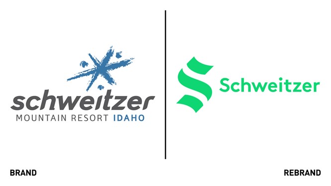
Schweitzer, the largest skiing resort in Idaho and Washington has launched a new, simpler and more distinctive visual identity that reflects its shift from a primary winter destination to a winter and summer destination. The resort has also changed its name from Schnitzer Mountain Resort to simply Schweitzer.
Taking inspiration from its history and celebrating the local landscape, the new logo, an ‘s’ that consist of three balanced and symmetrical strokes, is both a bold reflection of its past and a modern symbol for the future. The strokes, aligned on a 45° angle, recall the blackletter crossbar of the originally 1963 logo and reflect the physical influences on the resort: the peak of the summit, the flowing terrain and the lake below. The logo is created to imply history and the back-and-forth motion of descending a mountain.
The new wordmark aims to compliment the logos’ clean and bold style, while the rounded shapes of the letterforms were created to communicate Schweitzer friendly, open vibe. It is custom-made to match the 45-degree angles of the new logo and is more readable.
The colour palette reflects the dynamic interaction between the different natural environments that characterise Schweitzer. Although the new primary brand colour- green- is based on the resort’s enduring connection to the natural environment, the secondary brand colours of yellow and orange are inspired by the hues used in a different range of outdoor wear, from retro-ski outfits to more modern mountain bike clothing. The colours were chosen to reflect the vibrant and radiant spirit of Schweitzer.
The new design seeks to retain all the elements that endeared Schweitzer’s earliest customers while creating space for the brand to evolve.


