#NewBrandMonday: 13 July
Here are this week's selection of newly launched brands from around the world. For more from #NewBrandMonday, follow @Transformsays on Twitter.
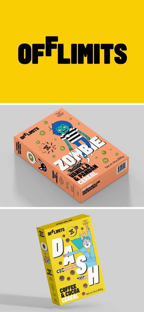
OffLimits
Global Independent design consultancy Pentagram created the packaging and brand identity for American ‘cereal-with-attitude’ and culture brand, OffLimits. The brand has different flavour-profiles designed to match ones mood- according to whether your aim is to feel ‘wired’ or ‘tired.’ The packaging and identity centre around two characters, DASH, who appears on the caffeine-infused coffee and cocoa flavour, and ZOMBIE, featured on the more mellow vanilla flavour. The characters interact with each other, keep pets, post on their own Instagram accounts and join together to create an extended OffLimits family. Although playful and humours, these characters and their contrasting personalities are also used by the brand to destigmatizes difficult conversations about mental health. Each order contains a carefully constructed activity sheet with different stress and anxiety relieving activities for people to work through while eating the cereal.
“The name OffLimits serves a dual purpose. It’s a playful take on the sugary treats that always seem to be out of reach when we’re young and also represents the element of defiance that’s engrained in the brand’s DNA,” says brand creator Emily Elyse Miller.
The bright and bold logo represents just this idea of cereal being ‘off limits,’ with the second ‘F’ being out of reach. It is accompanied by a bespoke typeface and a saturated colour palette.
“The logo mood board was accompanied by a child reaching for the second ‘F’ just out of reach. It has this playful vibe that you might associate with the curious nature of kids. But the true rebel mindset of the brand views the ‘F’ as defiant, flipping off the traditional ways of doing things and creating a new world of its own floating out of alignment with the other characters,” adds Miller.
The brand language, like the colourful packaging, is dynamic, irreverent and fun reflecting the cereal’s fun identity, which is further reinforced by its strong online presence where the toy store is a modified, arcade-style online experience. The founders of OffLimit sought to create a strong community around the brand, with a focus on artistic environments worldwide. It created a digital art gallery as a result of gallery closured ruing Covid-19, with the aim of supporting diversity and counter culture and encouraging cereal fans to support artists and school art programs.
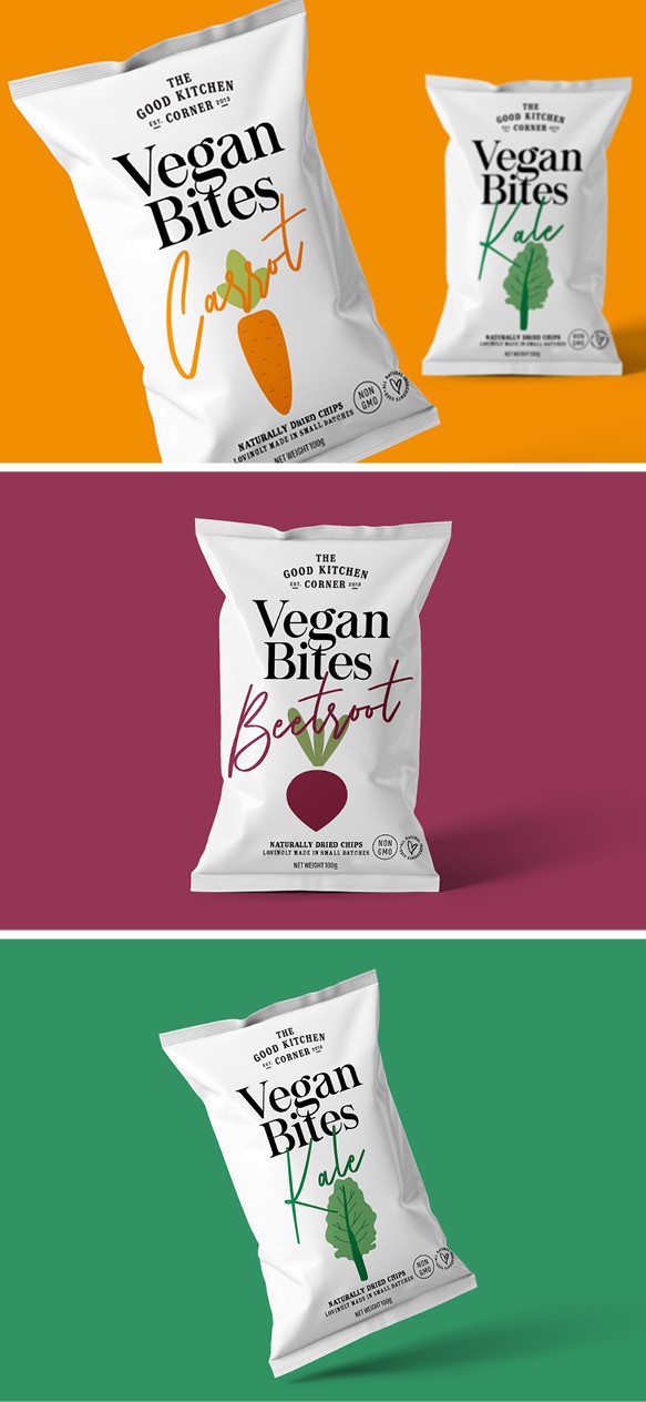
Vegan Bites
The Good Kitchen Corner, an Indian brand that promotes clean eating, worked with Delhi-based design agency Firstbase to create a packaging that would stand out on shelves and also stand for its brand value and character. In a market where hundreds of products are competing for the attention of the same consumers,’ the Good Kitchen Corner’s Vegan Bites had to adopt an authentic design and identity. Firstbase aligned the new brand with the vision of the company by using fresh colours (purples, greens and oranges) hand-drawn illustrations to showcase the different flavours and clean typography. The packaging is its bare essentials that project the brand story, steering clear from information overload. The overall result is a simple yet genuine identity that conveys the brand’s mission.
“We aligned the design with the vision of the company by using vibrant colours on a white base, hand drawn illustrations and clean typography. We stayed away from information overload and reduced the design to its bare essentials that truly projects the brand story. Keeping it simple.” Says Harleen Mehta, the creative strategist of Firstbase.
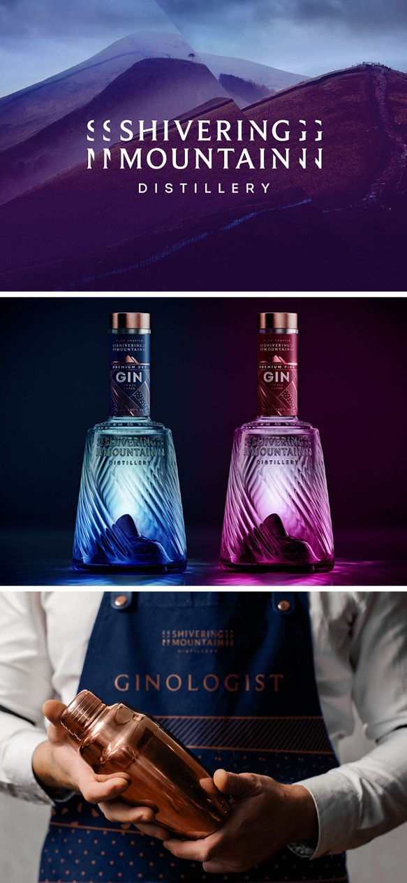
Shivering Mountain Gin
London-based relative brand and design agency the Allotment developed a new branding for Shivering Mountain Gin, a small-batch, handcrafted premium gin distillery in the Peak District which will launch a premium dry gin with a London gin profile and a premium pink gin crafted with real grapefruit juice. At the centre of the brand identity is its story and its roots, starting from the name after the mountain that dominates Hope Valley, the location of the distillery. Inside the bottle Mam Tor (Shivering Mountain), which, with its historic landslide, sits proudly inside the bottle while the mountain’s geographical coordinates, are hidden at the base of it. A subtle geological theme runs through the logotype with an integrated fault line and shiver effect to ensure there’s no doubt about the influences and origins of the gin. The colour palette was inspired by the Blue John and copper minerals extracted from the hills around the distillery.
Every brand touch point delivers on the quality promise, to everyone who buys or sells the gin, that Shivering Mountain has been ‘forged & foraged for peak perfection’.
The visual identity is forged by geological and botanical patterns which hint at the gin’s unique ingredients. The Allotment wanted to create a brand that would stand-out as a premium beacon of exceptional quality and authenticity in an overly saturated market.
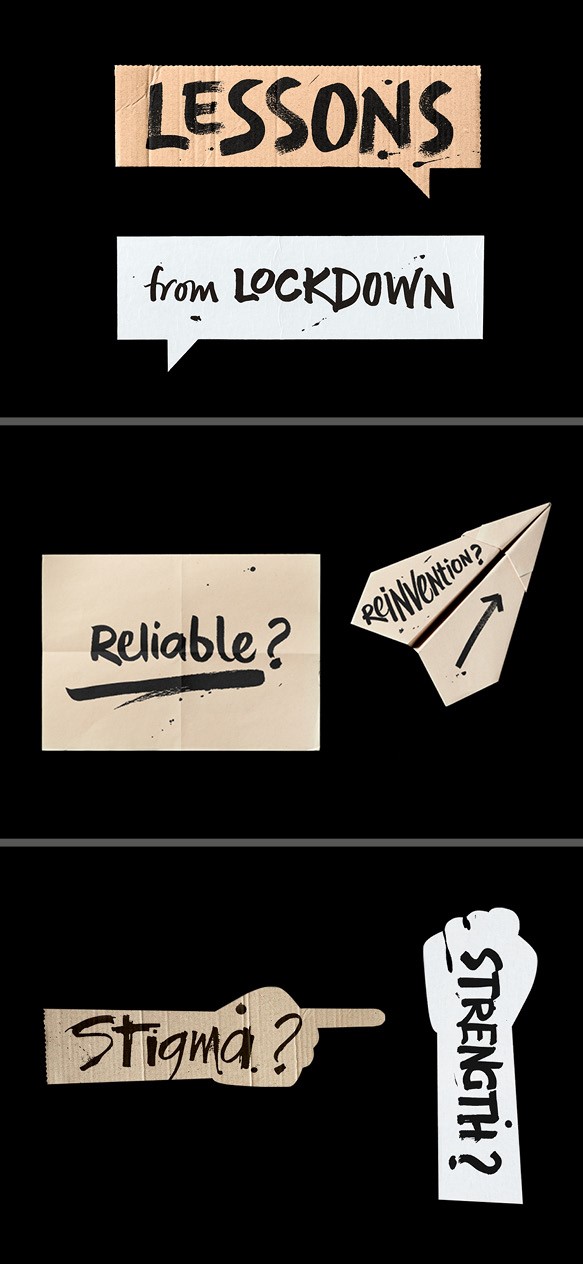
Platform - Lessons from Lockdown
Mental health and social change charity Platform worked with Cardiff-based design studio Clout to develop a campaign for a series of national, online discussions around the impact of lockdown on vital public services. The online facilitated events running in July are designed to get a deeper understanding of the impacts of lockdown from a range of people working in mental health, social care, substance abuse and homelessness. Clout created a digital campaign to bring people together to contribute by s haring future ideas. It developed a campaign logotype for ‘Lessons from Lockdown’ that suggests conversations in the shape of an equal sign. Clout also collaborated with lettering artist Peter Horridge to develop the look for the campaign, including hand lettered questions and words which, applied to a series of cardboard and paper silhouettes, created a ‘homemade’ feel.
“During the pandemic, our collective thoughts and emotions were expressed in wonderfully creative ways. This spirit of self-expression and the immediacy and importance of improving public services inspired the look of the campaign,” says Michael Smith, Clout’s creative director.
Clout created content for digital invitations, event reminders, website, social media and Zoom backdrops as part of a phase 1 of the campaign.