#TransformTuesday: 14 July
Here is this week's selection of rebrands from around the world. For more from #TransformTuesday, follow @Transformsays on Twitter.
NI
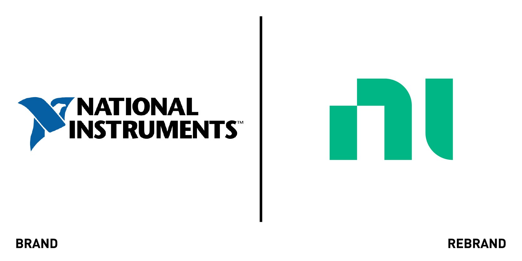
For the first time since its founding in 1976, automated test and measurement system software company NI worked with global design studio Gretel to develop a modern new brand identity strategy that elevates the brand beyond traditional category signifiers. With customer needs shifting from individual software and hardware products to holistic systems and services, NI is in constant state of growth, which led it to step out of the confines of its test and measurement category and build an adaptable brand that would be clear, effective and approachable across different sectors. . The key thread of the identity strategy hinges on a newly articulated purpose: Engineer Ambitiously, which highlights NI’s human and inclusive role within the tech industry and challenges everyone to think bigger, aim higher, go faster. The new visual identity reflects this strategy, balancing hard and soft to imply the equilibrium between rationality and creativity, hardware and software that sets NI apart.
“NI’s new, modernized brand persona crafts an image of NI as connectors of people, ideas and technology with a clear expert perspective– someone who sees opportunities throughout the process. NI is intelligent, active. It’s all about putting pieces together, connecting systems, finding new ways to think about complex ideas,” says Gretel’s strategy director Daniel Edmundson.
The colour palette was also revitalised, moving away from the standard blue and gray colour scheme and opting for an earthier, greener palette. “We set out to develop a mature palette that transcends the tropes of technology and pushes the brand into a more human, everyday natural space,” adds executive creative director at Gretel Ryan Moore.
The rebrand was implemented fluidly across every touchpoint, from presentations to print publications to campus installation and digital platforms.
Messiah University
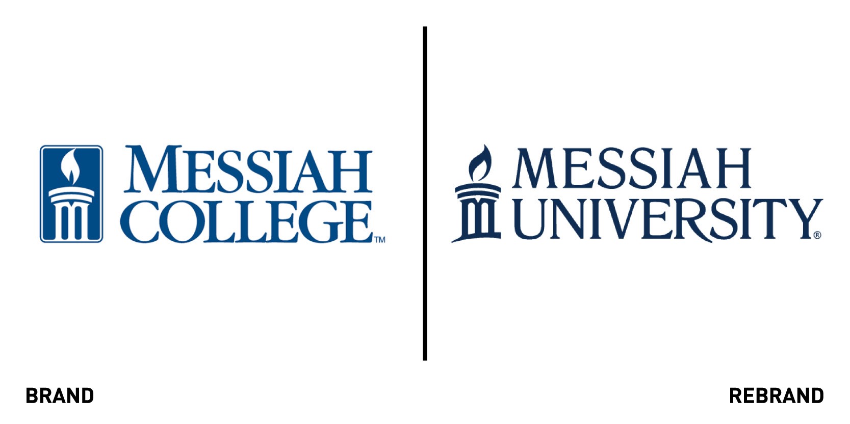
Pennsylvania-based Christian Messiah College becomes Messiah University in an attempt to extend its mission to educate undergraduate, graduate and adult degree students. The name transformation comes alongside a completely new visual identity. The new logo represents both a connection to the university’s past and the momentum of the future, with all the promises it holds. The flame in the logo is the light of spiritual and academic knowledge, while the three pillars it rests on symbolise the Christian trinity and the tri-part foundation of Messiah’s mission: intellect, character and Christian faith.
The new tagline, ‘your world seen anew,’ represents the possibilities offered by the university to open up student’s lives, faith and world, offering a new perspective. The new identity centres around the stained-glass window pattern, which serves as a metaphor for the students at Messiah, with each of them bringing valuable perspectives that are celebrated throughout the shared love of Christ. Each individual contribution is woven together to create a community and something special, like a strong stained-glass window. While the iconic Messiah blue and white colours were retained, the rebrand includes a new light blue and grey as secondary colours, and a bright tertiary colour palette to emphasise the vibrant stained glass window theme.
“In many ways, university status is a much more accurate reflection of how Messiah has functioned for several years now. With our comprehensive offering of undergraduate and graduate programs in both the liberal arts and applied sciences Messiah’s educational profile is already well-positioned with the academic distinction of a nationally recognized, private Christian university,” says Kim S. Phipps, president of Messiah University.
Rangers Football Club
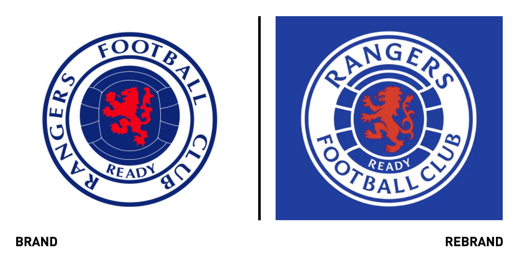
European football club Rangers worked with Scottish creative agency See Saw to create a new brand identity as part of its goal of implementing industry-leading and dynamic digital transformation strategy aimed at supporting the club’s continued growth. The new visual identity centres around the name ‘Ranger’s which boldly sits at the top, while a revitalised lion rampant and ball sit larger and more proudly within the design. The rebrand brings renewed vigour and precision to the logo, while honouring to the courage and history portrayed in the original club emblem.
“The Rangers READY crest has been designed to add balance, power and a stronger presence to the well-known Rangers brand. Incorporating a new visual language for use in the digital age, a new custom typeface and re-energised colour palate has been created for perfect clarity, not matter where it’s applied,” says Maurice Hynds, See Saw’s creative director.
As part of the rollout, global socially-led creative agency We Are Social worked with Rangers to create digital assets to tell the story of the club’s crest over the year, including a 60 second film, produced by the internal design team.
Waze
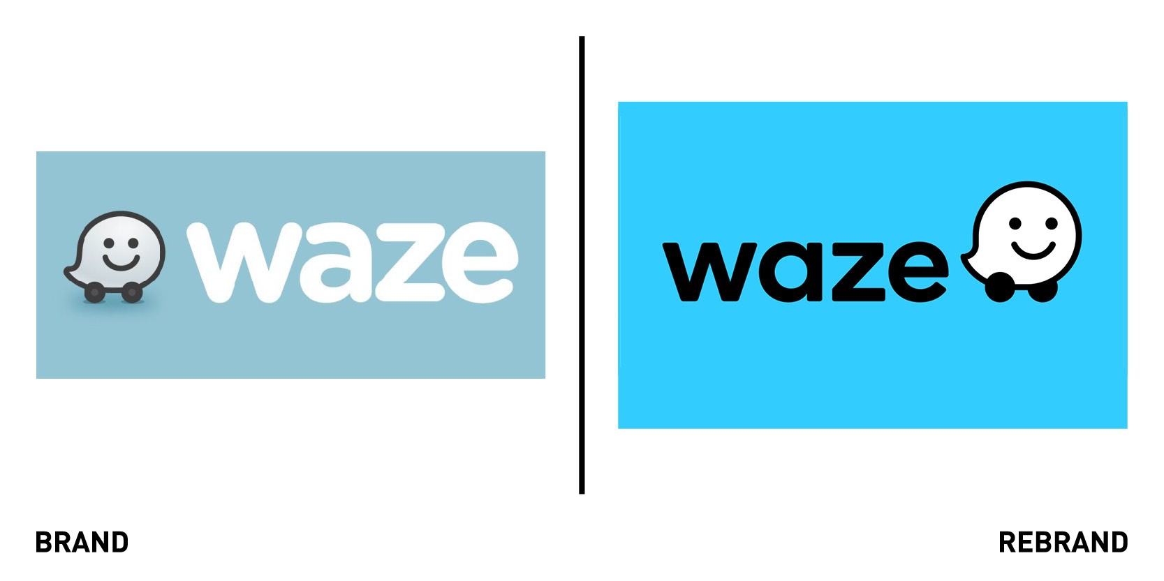
Community powered navigation app Waze worked with independent design consultancy Pentagram to develop a new identity with a universal system that enhances the platform’s collaborative spirit and provides a better road experience. The new identity has updated the iconic Wazer symbol, introducing a set of new ‘moods; that help users more express themselves more authentically within the app. The Wazer features a rounder, more upright form with the wheels placed on either side of give it a sense of depth while more clearly suggesting a speech bubble, emphasising the app’s focus on communication. The new system also includes colourful visual language ‘Block by Block,’ inspired by the modular design of the city grid, roads and streets and a witty and welcoming brand voice. The system organises information into colourful ‘block-scapes’ that create an recognisable world of Waze across different contexts, from the app to the website. To further highlight the humanity and sense of community of Waze, Pentagram added 30 new Moods, which offer a broader range of sentiments, to focus on the emotional experience of driving and help users connect with each other.
Emphasising the vibrant and dynamic spirit of Waze, the new identity creates a visual language that unifies the look of the brand while reinforcing its joyful sense of individual expression. The logotype is based on Boing, the sans serif typeface that combines personality with utility and has rounded corners for a friendly look.
Knickerbox Planet
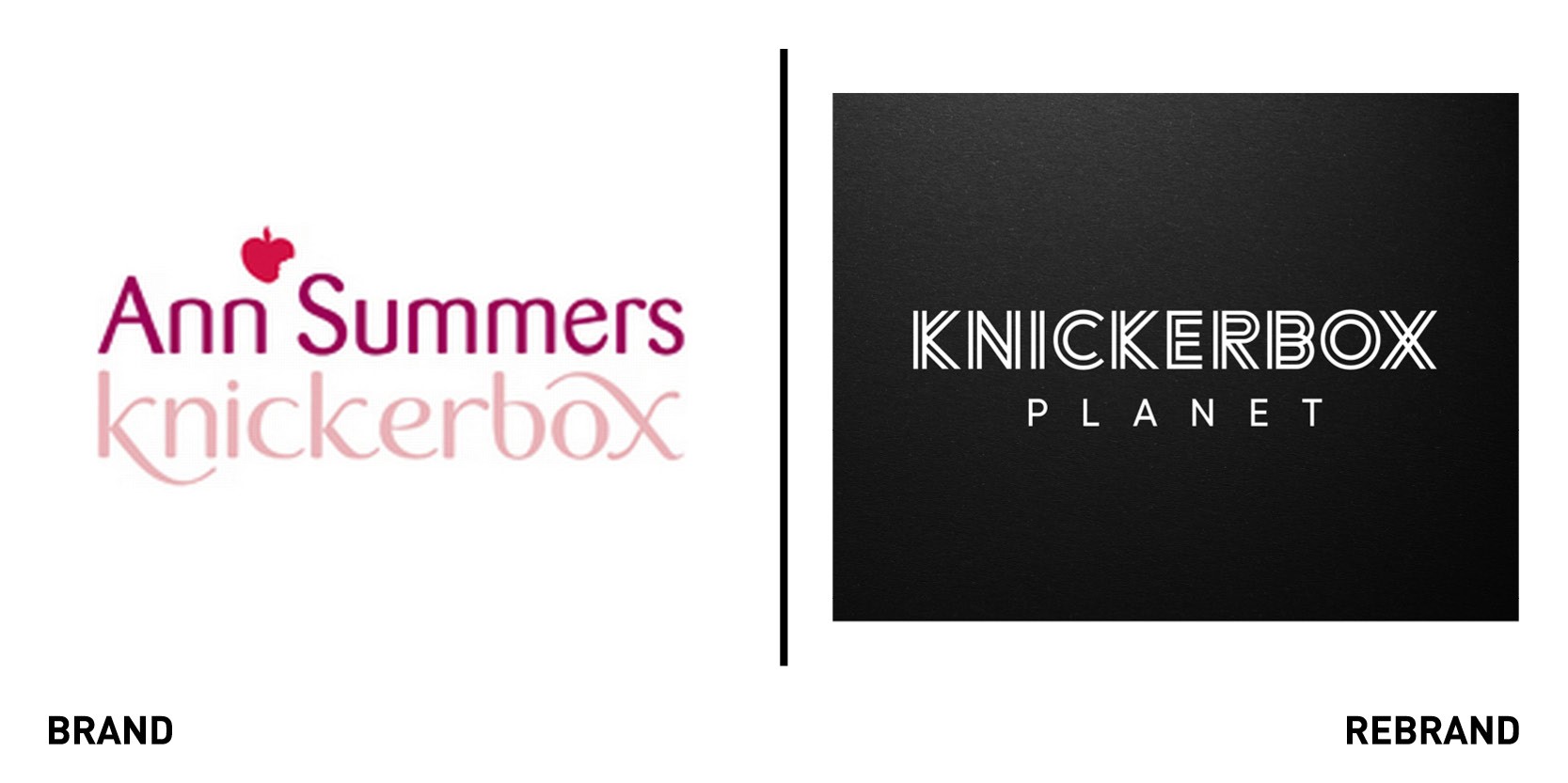
London-based agency Free The Birds worked with Ann Summers lingerie line to create a bold brand identity, strapline and manifesto for a new range of sustainable lingerie, Knickerbox (KBX) Planet. The lace in the garments is made from 100% recycled fibres and all the packaging uses recycled and biodegradable materials.The brand is centred around a distinct, black and white three-line KBX logo and bold mission statement: ‘Be Bad Do Good,’ which reflects the idea that although KBX Planet’s eco credentials are 100% true, it doesn’t mean the branding has to be soft greens and beiges. This concept is further emphasised in the KBX Planet brand manifesto, which focuses on the pleasure of having ‘a filthy mind and a clean conscience.’ The custom-designed typeface is inspired by the intricate pattern of the lace and the triple strap designs used in the lingerie range.
We love that Free The Birds understands what our customers are all about – young women who work hard, have fun, want to feel sexy and confident but not at the expense of the environment. That means KBX Planet really stands out among other eco-friendly clothing, fits in with our ethos and puts us in great standing to achieve our long-term ambitions for the brand,” says Natalie Amosu, CMO at Ann Summers.